


Examples of good and bad design on the Catalyst website at 20/03/23. With advice and suggested improvements from content design and user experience design experts.
This resource is for:
- Website managers and their managers
- Anyone interested in improving their website’s content and interface design
This is the 5th in an irregular series of articles critiquing charity websites. By showing you examples of good and bad design you learn more than if we just told you.
This time we’re critiquing the Catalyst website! The crit covers two overlapping types of design:
- Content design - how words, pictures, media, data are used
- User experience design - interface, visual elements, information organisation
Credit to Lauren Pope (content designer working with charities) and Becky Colley (product designer at BUPA) for their independent critiques of the site.
Site goals
Becky and Lauren critiqued the site as it was in late February 2023. At that time the main site goal was:
- Help people in non-profit organisations to build their capacity and knowledge in using digital, design and data in their work.
The site also had two secondary goals:
- Help organisations supporting charities to get better at using digital in their work - including funders and umbrella organisations
- Support digital agencies and freelancers to participate in the ecosystem of charity digital work.
The crit
We critiqued 3 pages - home, the services landing page, and the resources landing page.
The crit uses an ‘advice-first’ format to make each point. Underneath each point you can read about the problem with the page and details of the recommended solution.
See which advice points might apply to your own site!
I. Homepage
Goal: help people understand Catalyst, how it can help them and quickly find something useful (whether services, resources or something else).

1. Use common words that people understand
Problem: “civil society” is an uncommon way of describing the non-profit sector.
“The term ‘civil society’ made me pause - it’s not familiar to me at all, I had to Google it. Is this the most familiar term people use to describe your sector?” - Lauren
Solution: use a more common term. The site uses ‘charities’ elsewhere. It could use ‘third sector’ or another term that’s in more common use. Note: in 2020 Catalyst canvased views on how best to describe civil society organisations. We found that there is no easy answer.
2. Talk to people directly through your copy
Problem: there’s not much ‘you’ copy, which makes it feel like you’re talking about people, not to them
Solution: use 'you' instead of the third person more consistently.
“Using ‘you’ a bit more could help to draw people in and make a connection for example ‘Free resources from across our network, curated to support charities you at every step of their your digital journey’” - Lauren
3. Make link text descriptive
Problem: the ‘Support & services’ button text doesn’t make it clear what you’ll get if you click it.
Solution: make it more descriptive. Use a full sentence as the link text, for example 'find out more about the services and support we offer'.
4. Avoid ampersands
Problem: 'Support & services' uses an ampersand. Ampersands are not accessible.
Solution: use the word 'and' instead.
5. Space words out on your main menu
Opportunity: there is room to space out the words more. Spread them out so they’re easier to scan and space is utilised better.
6. Beware of magnifying glass icons
Problem: magnifying glass icons can be confused for zoom icons, especially for users with access needs who struggle with icons.
Solution: replace with the word “search”.
7. Remove repetitive content
Problem: the ‘Resource’ tag is a bit redundant as it’s under a resource header. Ditto for ‘News’.
Solution: get rid of the tag, or replace it with something more meaningful from the taxonomy.
“Is there a need for these on this page? The section heading makes it clear, so I’d hide the purple “resource” and “news” labels to remove visual clutter and save space.” - Becky
8. Start names of resources with keywords
Problem: the resource names don’t start with the keyword, which makes them a bit slow to scan.
Solution: start all resource names with the keyword e.g. ‘Focus groups: how to get useful user research insights’ not ‘How to get useful user research insights from focus groups’.
9. Test with a screen reader
Problem: screen readers struggle at a few points (note: not shown on screenshot).
Solution: test with a screen reader and apply fixes.
10. Use descriptors for news items
Problem: news item titles the same and don't show a descriptor. This makes it difficult to know which are relevant or what to expect if you click them.
Solution: add a sub-title or descriptor like the resource items have.
“The sub-titles on the resource items help me understand what I’m clicking through to — it would be useful to include this for news items.” - Becky
11. Avoid excessive content and options
Problem: potentially bloated page.
“Do users scroll this far down? Is this section necessary? Is it necessary on all 3 of these pages (or all website pages)?” - Becky
Solution: test whether the strip ‘Offer your services / Join a network / Stay in the loop’ has value to site visitors.
12: Remove non-essential info
Problem: 'Catalyst is evolving' banner is a bit hard to spot
“I completely missed this until the very end due to banner blindness. Is this info vital?” - Becky
Solution: move to somewhere more visible, or use a more contrasting colour, or remove if not needed.
13. Reconsider the popup sign up form
Problem: popup sign up forms can annoy visitors (note: not shown on screenshot)
Solution: let users find it within the site if they want to sign up for the newsletter.
“They can cause friction. But I can see it’s a key driver of site traffic. Maybe only show every few visits, rather than every time? Especially for returning users.” - Becky
II. Support and services landing page
Page goal: help people find a useful service, or decide if there isn’t one for them.

14. Use sentence case rather than title case, and avoid ampersands
Problem: the page header ‘Support & Services’ uses title case and an ampersand. Both make it harder to read.
Solution: use sentence case. Write ‘and’ in full both here and in the breadcrumbs.
“Ampersands are not accessible — use the word 'and' instead” - Becky
15. Group similar services together
Problem: the 9 service cards are laid out in one big block. This makes skimming harder. Finding what’s relevant to you takes longer.
Solution: consider grouping the services under sub-headings. For example: Peer support, Expert advice, Research, Training, etc
16. Make service names easy to see
Problem: putting the service name in the card’s tag makes it easier to ignore. And writing it in all caps makes it harder to read.
Solution: make the service name more visually impactful. This will also help people looking for things by name.
17. Make cards clickable rather than only the text
Problem: you have to click on the service's title to get to the service's page. This is ok but could be made easier for the user.
Solution: make the whole box clickable.
18. Consider floating rather than fixed menu bars
Opportunity: add a floating menu bar. This type of menu bar stays at the top of the screen while a user scrolls the page. It makes it easier to navigate to other sections, or use search, without scrolling back up to the page top.
III. Resources landing page
Page goal: help people find a resource they need or quickly see if it’s not there.
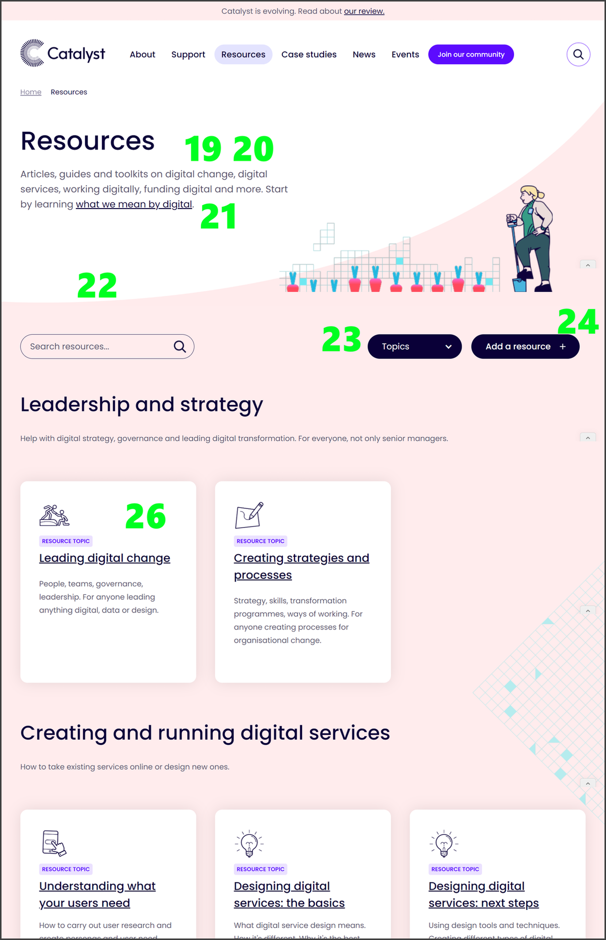
19. Show the scale of any resources available
Problem: the intro paragraph doesn’t give an idea of the scale of the resources available. Users don’t know what to expect.
Solution: say in the intro copy how many resources are available.
20. Show why resources are relevant and credible
Problem: the intro paragraph doesn’t let users know who created the resources and why they should trust them. This leaves them less certain about what they will find.
Solution: include copy explaining why these are credible resources that people can put their trust in.
21. Don’t add extra links unless there’s a clear user need
Problem: the link in the intro paragraph to ‘Start by learning what we mean by digital’ doesn’t make its value to the user clear. Also, it probably is not be what most users want from the page.
Solution: move the link into a topic category, like the other resources. Write about it in terms that make the value to the user clear.
“This link feels a lot like something you want the user to do, rather than something the user would want from a resource page.” - Lauren
22. Reduce scroll time to get to the useful stuff
Problem: it’s a bit of a scroll before you actually get to any of the resources.
Solution: link to the top three resources above the scroll point.
23. Avoid long drop down menus
Problem: the topics drop down menu is very long and unwieldy, especially as lots of the terms start with the same word. This will be frustrating for users.
Solution: make the names easier to scan as a list or remove the menu.
24. Avoid ambiguous icons
Problem: the '+' icon could indicate that the button is an accordion.
Solution: remove or replace with another icon.
25. Offer search and filter functionality for large amounts of resources
Problem: too many topics (19), and likely overlap amongst them. Also, users may be expecting a list of all resources rather than a list of topics. (Note: this is not numbered in the screenshot and the screenshot shows only 5/19 topics)
Solution: make this page function more like a search results page, with a full list of all the resources, and pagination. Let the user use the search box or filters to refine the results. This would help them find resources relevant to what they are looking for more quickly.
26. Make cards clickable rather than only the text
Problem: you have to click on the topic card title to get to the topic page. This is ok but could be made easier for the user.
“I suspect if you used Hotjar (or similar) you could see users clicking within the box to navigate to those pages, before then clicking specifically on the topic title/link”. - Becky
Solution: make the whole box clickable.
Further information
See our resources on how to make a good website.
Read other crits:
Support & services
Our free services help you make the right decisions and find the right support to make digital happen.
Learn what other non-profits are doing
39+ organisations share 50+ Guides to how they use digital tools to run their services. Visit Shared Digital Guides.
