


Examples of good and bad design on a charity website. With advice and suggested improvements from Shivy Das, product designer at SIDELabs.
The Dementia UK site offers information and support for people affected by dementia. Shivy reviewed the usability and experience of three aspects of the site:
- Navigation
- Homepage
- Helpline page
We’ve made that feedback open so you and others can learn from it.
Part 1. Navigation review
Dementia UK weren’t sure if their site navigation was useful or accessible for their users. The navigation (Fig. 1, below) appears on every site page. It is important because it is the main way users find what they need on the site.

The navigation’s layout takes up a lot of page space. Most of this space is taken up by the logo, helpline number, search and donate button. There are also 2 navigation menus - a secondary menu (top of screen, small grey links) and a main menu, below the logo.
Navigation elements are visually unbalanced
The layout and sizing of navigation elements is visually unbalanced. This affects how the user’s eyes move over the elements.
People’s eyes are likely to go first to the main image, then the large logo, helpline number, donate button and lastly the main menu. The main menu will be last because the other elements are more visually prominent. The greater visual importance given to these other elements is likely to distract the user from using the main menu to navigate the site.
This problem will repeat across the site because the navigation appears, as it should, on every page.
Users are likely to miss the secondary menu at the top of the screen.
Also, users using screen readers and keyboard navigation for accessibility will have to work through the secondary menu items first, then helpline, then the donate button, search and finally the main menu. Is this an appropriate journey for these users?
Too many links on the main menu

Each main menu drop-down (Fig. 2, above) offers a large amount of links. Having this many options creates an overwhelming experience for users. This can lead to a paradox of choice.
It also creates a long list to scroll through on mobile.
And people using keyboard and screen readers will have to work through every single link in the navigation from left to right to get where they want to be.
All of these issues could be tested and validated with users to understand how they interact with the menu.
Get support menu drop-down is the most overcrowded
Too many columns and poor layout in some drop-downs (Fig. 3, below) also affects text legibility. Column titles become uneven, links run onto 2 or 3 lines and it becomes difficult to see where links start and end.

Search problems
Dementia UK told us that the search functionality has problems. We tested it and found that search terms don’t always return appropriate results (if any at all). It needs more testing, but it would be better to remove the function than to offer a frustrating experience.
The majority of people on most sites tend to use navigation rather than search. They only use search when they know precisely what they’re looking for or when the navigation isn’t producing results.
Navigation advice
- Reduce the logo size. Stop it competing with the navigation. Make it act as both a brand identifier and a navigational element. This will free up space for more important content.
- Remove the search bar if it’s not accomplishing its purpose. This will free up space. Focus on improving the main menu for a better navigational experience.
- Create more space (padding) around navigation links. Because the keyboard focus state (how keyboard users know which element they’re on and interacting with) of each link covers the text slightly making it hard to read.
- Reconsider the secondary menu’s purpose and existence. Either improve its size and colour contrast to aid accessibility or combine it with the main menu.
- Quick win to improve main menu drop-downs: turn the drop-down’s pink titles into links to landing pages. Move the grey page links to these new landing pages. Then make these page links more descriptive so users understand better where each will take them.
- More considered approach: reorganise the site’s information architecture (or sitemap) in a way that enables you to create a simpler, easier to navigate and more user focused menu. This should mean fewer links to different pages and links within pages. This will in turn create a less disorientating or confusing experience for users.
- Alternative idea: use a 'mega-menu' (example in Fig. 4, below) to organise and present content in a visually appealing and legible way. Mega menus use short, descriptive and bold titles, with small descriptions and an icon for each link. Each link is spaced apart so they can be absorbed in a bite sized way, while the icon and description provide quick context for the user on what to expect.

Part 2. Homepage review
Homepage: hero section review
The hero section is the area that immediately shows underneath a site’s logo and navigation. Its purpose is to communicate to users what you have to offer, why they can trust you and what action they should take.
Dementia UK told us that the goal of their website was “to offer information about dementia and support for people affected by dementia”.
However, their homepage’s hero section (Fig. 5, below) focuses on encouraging users to donate through their will.
Receiving donations is clearly an important function of many charity websites. But since there are 2 donate CTA (Call to Action) buttons on the page, the hero section could be better used to serve user needs and the site goal.

Hero section advice
- Use the hero section to communicate Dementia UK’s important services such as the helpline or resource pages, or both. This would provide a more user centred journey for those seeking support or information.
- Check the colour contrast for text overlays on images. This will help accessibility.
Homepage: Get support and advice section review
Scrolling down the homepage, the second section provides information about Dementia UK’s support and advice helpline (Fig. 6, below).

For someone seeking support the content of this section could be quite overwhelming. There are 7 CTAs here, each one communicating slightly different types of information and actions. This many CTAs is likely to create uncertainty, increase the user’s cognitive load and lead to decision paralysis. A better experience would make it simpler and easier for the user to decide what to do.
Get support and advice section advice
- Identity 1 or 2 actions users can take to access help quickly. Turn these into clear CTAs with a short description of what to expect. Articulated and designed concisely this could even sit in the hero section.
- Increase the size of the image so that it fills up the left side of the section, with no borders. This will create stylistic consistency with the hero image and be more impactful.
Homepage: sections 3 and 4 review
These sections (Fig. 7, below) could be improved with visual design tweaks across the ‘cards’. This would create a more consistent and engaging user experience.

Homepage: sections 3 and 4 advice
- Add a title to section 3 to create consistency and provide context for the user.
- Section 3: improve the visual hierarchy (sense of order) between each card’s white title text, white description text and large button with white text. This will help the user digest each card. Try using a different colour for the title.
- Limit characters in each description for a more balanced visual and reading experience.
- Reduce the button sizes. They are too dominant and demand attention before the text.
- Make button text more descriptive. Users tend to scan websites to pick out the most useful information. The pink CTA will grab attention but not communicate what action it takes without having to read the text above. Descriptions such as “Learn about Dementia” or “Get a diagnosis” will help users quickly decide what they need.
Homepage: Latest news and blogs review
This section (Fig. 8, below) offers a lot of value by providing supportive, up-to-date content for what people might be experiencing. It seems a shame that this is at the bottom of the page - especially as research shows this is typically where people drop off the page.

It is difficult to find out how to view other blogs on the site. There is no clear navigation pathway (I had to click on an article then find a backlink). The other blogs show a wonderful diversity of topics, for example: advice for male carers; dementia and Diwali; menopause and support for Chinese families.
Latest news and blogs advice
- Consider moving this section up the page. These articles cater to a diverse range of audiences. This shows the breadth of support Dementia UK offers and creates a welcoming, inclusive experience. It’s worth testing the order of all homepage sections to see which leads to the most user centred experience.
- Rename the title to this section to something more meaningful that reflects the support that blogs provide.
- Be consistent in the use of links and buttons. Here titles are used as links where in sections 3 and 4 buttons are used. Doing this is more likely to match users’ expectations and reduce confusion.
Part 3. The Dementia Helpline page
The Dementia Helpline is one of Dementia UK’s most important services. It is linked to from both the navigation bar and the ‘Get support and advice’ section. Links refer to it as ‘Dementia Helpline’.
The Helpline page has an important job: to guide users to the helpline. But its information is disorganised and inaccessible. This could hamper the journey of someone needing help.
We see the first block of information on the page’s hero image (Fig 9, above). It is titled ‘Admiral Nurse Dementia Helpline’. This is different to the titles of the links that bring the user here (‘Dementia Helpline’). This inconsistency in labelling between pages is likely to make some users unsure if this is the same service or a different one.
The placement of this information block on the right seems a bit odd. This is because users tend to scan a page in an F shape or Z shape, starting on the left. Placing the block on the left would make the user’s eye fall on it first.
The way the information is overlaid on the image also makes it slightly difficult to read. The sentence also holds 3 calls to action (CTA) and is uneven making it harder to read.
Dementia Helpline page: Call to Action advice
- The call to actions in this block are the most important bits of information for the user. I’d recommend 4 separate call to action boxes at the top of the page to make them clear and direct. This includes the 3 current CTAs and ‘Book a virtual appointment’, a CTA from further down the page (Fig 10, below).
- Use bold headings and short descriptions to inform a user’s expectations of these 4 CTAs. Include the opening hours in the ‘Call the Helpline’ CTA, instead of highlighting them in a blue box near the middle of the page (Fig. 11, below).


Dementia Helpline page: layout and structure review
The rest of the page (Fig 12, below) could be improved further through a tighter layout and better structured information.

Dementia Helpline page: layout and structure advice
- Text should not take up the full page width. This impacts readability and information can get missed, negatively affecting user experience. Research shows the optimal line length for body text is 50–75 characters.
- Immediately underneath the 4 CTAs you could introduce Admiral Nurses. This should communicate who they are and what they do. Keep it short and digestible, with a link to find out more. This will reassure users and build trust.
- Potentially add short testimonials from people who have used the helpline to build trust.
- If 4 CTAs for getting help exist at the top of the page, the repetition that currently exists (Fig 13, below) won’t be needed.
- The ‘Other information and resources you might need’ section (Fig 14, below) offers some useful resources. However, the way links take up most of the content, along with small bullet points makes this section difficult to read.
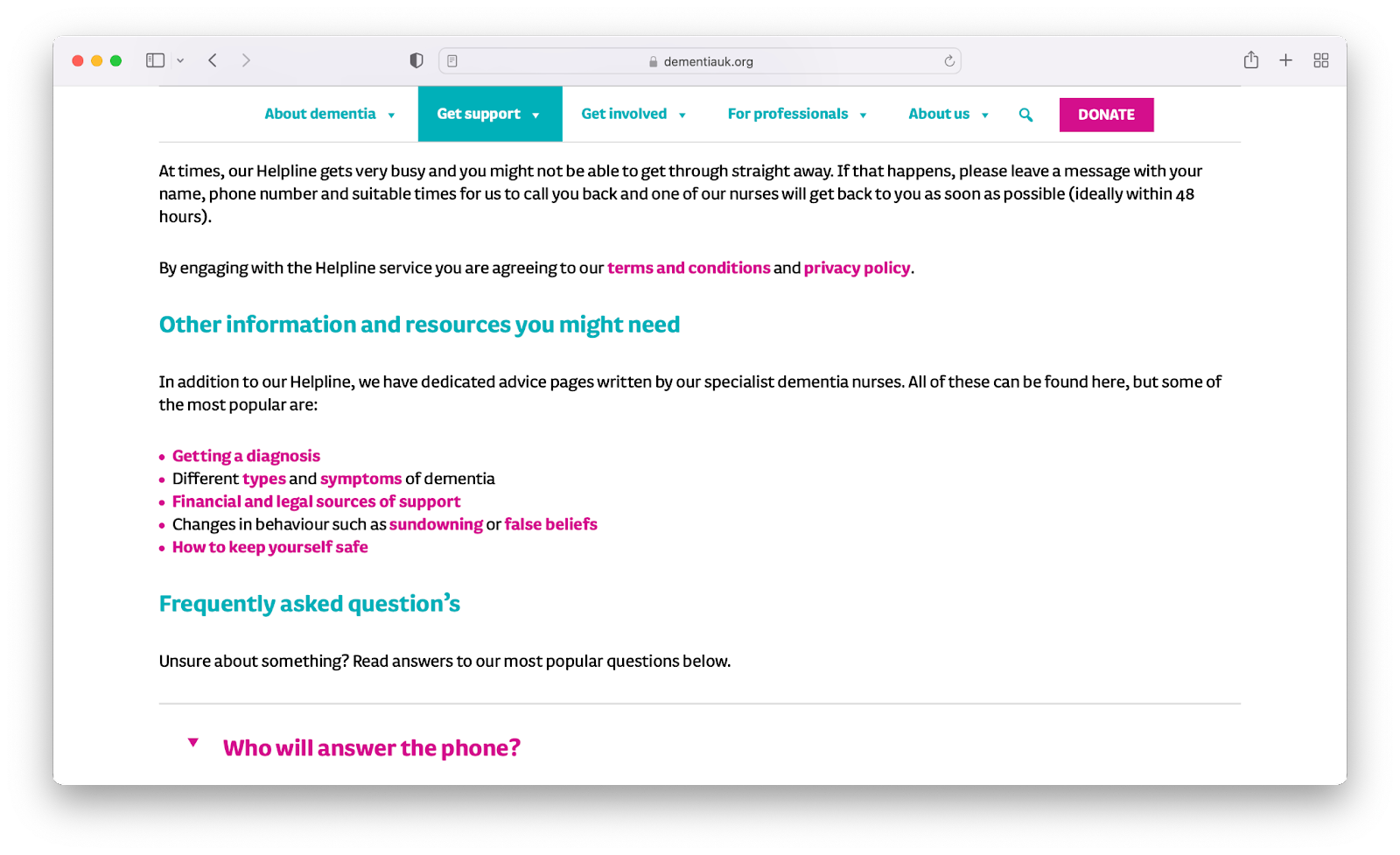
- This section also feels like it should come after the Helpline FAQs to keep the flow of the content more helpline focused before signposting users to other pages.
- The section could also be framed differently to feel more useful to the user rather than ‘Other information…’ such as ‘Topics we get asked about most’. This also makes it feel more relevant to the helpline page.
- If you’re offering users a list of helpful links, make them open in a new tab so they don’t lose the page they’re on. Links within pages which lead to more links within other pages can make users disorientated.
Thanks
Big thanks to Dementia UK for putting their site forward for a crit. We appreciate your openness, bravery and willingness to help others learn.
Read other crits:
Support & services
Our free services help you make the right decisions and find the right support to make digital happen.
Learn what other non-profits are doing
39+ organisations share 50+ Guides to how they use digital tools to run their services. Visit Shared Digital Guides.
