


Examples of good and bad design on a charity website. With advice and suggested improvements from Kat Quatermass, content designer at Neontribe.
This is a follow up to Website Crit #2: Reach Volunteering Website. It critiques the library part of their website.
We’ve made our experts' feedback open so you and others can learn from it.
Thanks to Reach Volunteering for putting their library forward for this critique.
What is Reach Volunteering's volunteer project library?
Reach Volunteering matches volunteers with professional skills to charities who need those skills. They have almost 4 times as many volunteers registered as charities seeking volunteers. They want to convince more charities to use volunteers.
Their research shows charities have 3 main barriers to getting involved. Charities:
- Don’t know about skills based volunteering
- Find it hard to imagine what kind of projects they could do
- Can be hesitant to try something that they feel is unproven
The library aims to help those organisations who do know about this kind of volunteering decide how it could work for them.
The library collects together:
- Templates that set out how to plan a project that volunteers could do
- Selected volunteers from Reach’s database
- Example projects currently on offer
- Case studies and testimonials about previous projects
Visit the volunteer project library.
What we did
Together with Rachel Harding (Neontribe’s User Experience designer) I spent an hour reviewing the Volunteer Project Library. Then I spent an hour talking with Janet Thorne and Sarah Dewe at Reach Volunteering. It was important to me to understand the goals for the Library.
The library has 3 main parts:
- A landing page (a grid of topic-based choices called 'Projects')
- Projects landing pages - each with a choice of individual projects and available volunteers
- Individual project pages - each with downloadable templates
We offer a critique of the landing page, 1 projects landing page and 1 individual project page.
For each part, we have listed some “quick wins”. These are user interface (UI) or content improvements that would improve the experience.
Then we have listed “Things to test”. These are things that might mean that the library doesn’t help users the way it hopes to, and need more than a simple change.
1. Is the Library landing page useful?
Quick wins
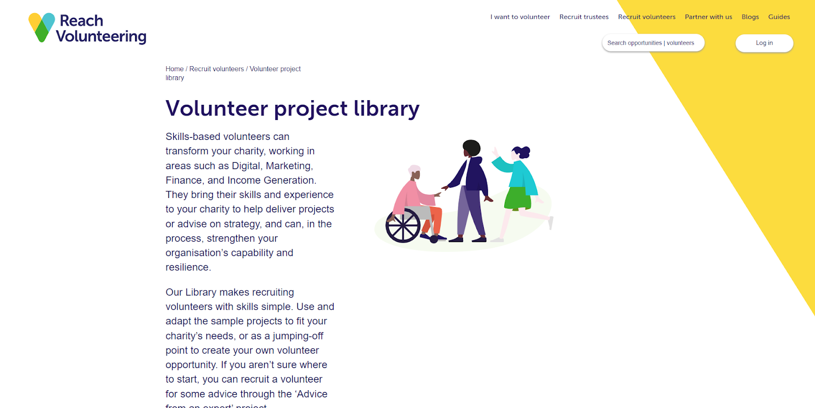
1. Remove the introductory paragraphs (Fig 1). Instead provide clear short instructions about how to use the project library.
Tip: People usually skip introductory paragraphs, especially if they are mostly marketing blurb.
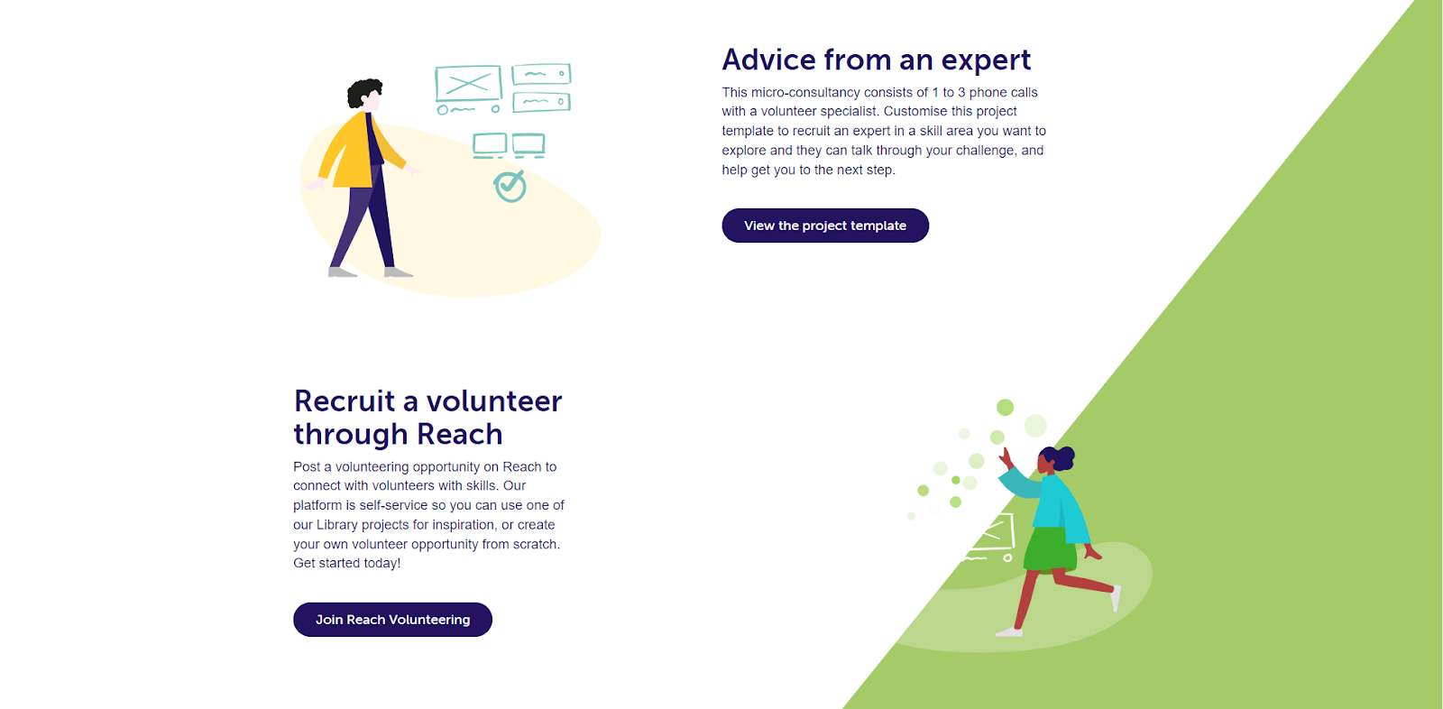
2. Keep all headers on the left hand side of the page so people don’t have to jump about (Fig 2).

3. Don’t use headers to explain the work in progress part of the site (Fig 3). Instead provide just one single grid and mark the cards as “includes templates” when a topic based section has them. The current headers are confusing.
Things to test
1. Can you actually get people to this library at a point in their bigger journey towards volunteering when it is useful to them? People probably want the templates, the project examples, the volunteer previews at different stages in their thinking. How will your marketing prepare people at each thinking stage for how they can use this library?
2. Are the project topic labels actually meaningful enough to help people find what they need? Other research Neontribe has done has shown that there are very big areas of overlap between how people use these terms. For example - if someone is thinking that they need help with design - which of the three topics - creative services, digital or communication and marketing - will they look in?
Tip: Whenever you decide to divide a collection into topics or categories, it’s important to a) make sure you test those categories and b) offer a “browse or search all” option as well
3. Does the “advice from an expert” panel help users while it is shown as part of the library? It appears on the landing page and every other page of the library. But it is styled in the same way as the rest of the page - so it’s hard to understand that it is actually an advert for a different service all of its own. It may be confusing to people here, whereas if it had its own pathway with its own specific social media and e-news promotions it might be clearer how it can be used.
Tip: Sometimes we rely too much on our web pages to be able to promote an idea, when what we really need is a dedicated marketing or social media campaign.
2. Using a projects landing page
We critiqued the digital volunteering projects page (Fig 4.).

Quick wins
1. Review the template titles (blue cards). “Moving a service online” is a good title - it reflects an organisational need that might be in someone’s mind. But “SEO audit” is a jargon title - rephrase it to “getting better search results for your website”.
Tip: Titles should always explain what something does in words your users would use. Getting rid of jargon is a first step.
2. Consider making the template cards more like others on the website, so that brand trust is built up. The blue background does pass accessibility checks, but it takes more effort to read than the white cards elsewhere on the site.
3. Reduce the number of volunteer cards visible - 10 is overwhelming. These cards use a different design to others on the site. Reach have improved the user experience by removing unnecessary information but also lost some brand flair (Fig 5 shows old and new style cards).

Tip: Striking a balance between usability and design flair is often challenging. Look for the small elements that don’t compromise usability, like the yellow stripe on the first card.
4. Add a one click route back to the landing page. This will help with the problem we discussed on the landing page of people not knowing which topic they need.
5. Make the title of each panel on this page a clear call stating why people should use it. At present the templates have no title, and the other panels vary whether they explain how they will be useful or not.
Things to test
Once you’ve chosen a topic, the library offers a lot of different choices - not only templates. The Reach team have done this because they believe that different visitors will find different things helpful. They want to offer freedom of choice.
We suspect that people might find the choice overwhelming and leave confused. But we also recognise that anything that is too heavily guided might put people off. So we understand why Reach want to try it.
Reach need to test which bits of the page are most used.
Tip: Most users don’t get very far down long pages with lots of choice. Use a tool like Hot Jar to see if people are actually making it to all your page elements.
3. Using an individual project page
We critiqued the user researcher project page (Fig 6.) and its downloadable template.

Quick wins
1. Check that the content on the page is inclusive of smaller charities and includes a helpful description of the project.
2. Simplify and use bullet points in the “how to use the template” instructions in the template.
Tip: When you create word documents or PDFs, remember most people will read them on the internet first, so use the same good practice in content creation as you would for online copy.
3. Use a coloured border not a coloured background for the boxes in the template. This will make it cheaper and easier to print as well as easier to read. You can also change pattern as well as colour, increasing accessibility. Figure 7 shows examples.

Things to test
Can people follow the templates and create their own project entry?
Reach’s templates are quite long and detailed. They also use a method of providing both a template - spaces to put information - and an example - one possible version.
We like this comprehensive approach but are worried that some people might feel that it is a lot of work or hard to use. We have found this happened testing a tool Catalyst supported to help people choose new software. We recommend finding people who are ready to create a volunteering opportunity then asking to observe them filling out the template.
Tip: Whenever you plan to re-use a method of doing something across multiple pieces of content, you should test that it works well with people you want to use it.
Why do a crit like this?
It's often better to show rather than tell what good design is. We’ve already written plenty about good design.
Read other crits:
#2: Reach Volunteering's website
Support & services
Our free services help you make the right decisions and find the right support to make digital happen.
Learn what other non-profits are doing
39+ organisations share 50+ Guides to how they use digital tools to run their services. Visit Shared Digital Guides.
